So where do we start?
This is a simple Gann Management chart of IBM, which shows two horizontal levels. We will be referring to these levels or bands as 'Decision' levels or 'Decision' bands. As the name implies these levels are future prices where decisions will be made. When the levels are hit the movement of the market itself, on hitting the level, will determine what action to take i.e. Buy, Short, Sell or perhaps do nothing! The decision time is not the time to have opinions but to let the market itself dictate what action you should take. Bear in mind that when Markets, Shares etc make important changes in trend it is always a time of high stress. The majority opinion will be for the trend to continue either up, up and away or down, down and under. Despite such contradictions this will be the time to act decisively and without fear and buck the general view. To do this why not let the market decide for you? When fully Gann trained you will know, days, weeks or even months in advance, the levels where the Market, Share, Currency, Commodity etc will probably bottom or top out. Only the Market really knows and in the vast majority of instances it will be obliging enough to let you know! By the application of that most important of human traits, patience, and observation of short-term moves at decision levels you will be invited to take the correct market position without any judgmental effort on your part. The rules will highlight the time and day to take action and make it a simple affair to pull the trigger. The same applications apply when profits are to be taken.
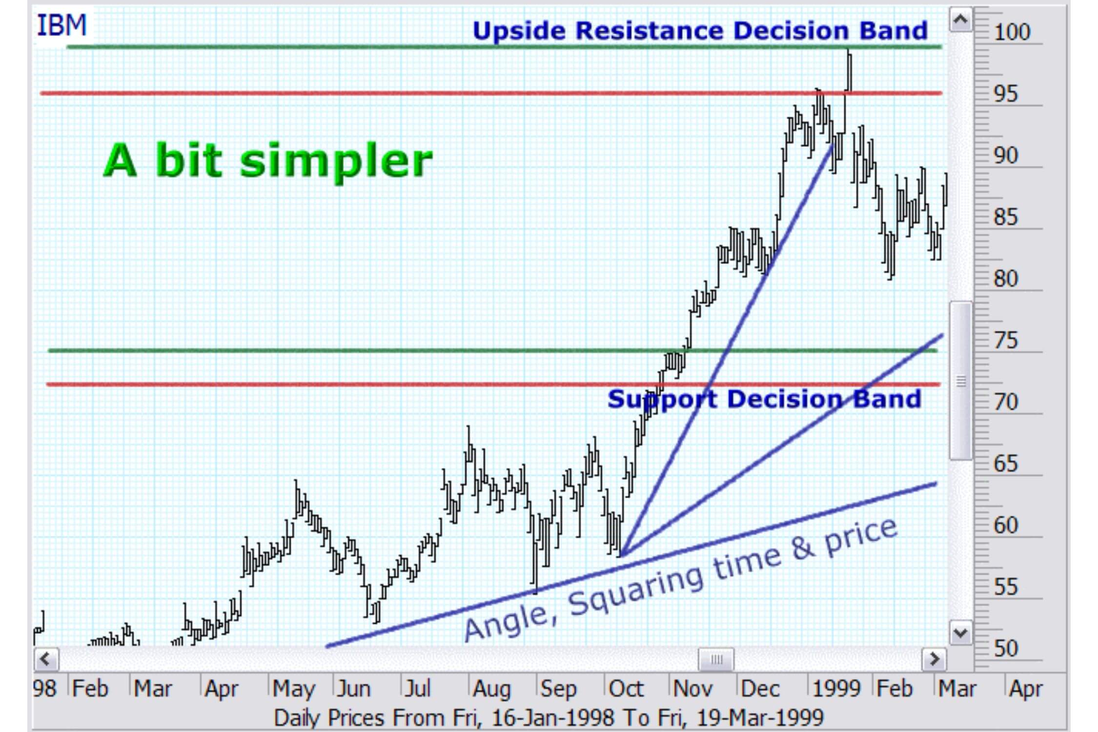
The calculated levels are not meant to predict but are purely future levels, which, if reached, will provide a level and time of decision. The process of prediction making will be the subject of later courses.
The chart for IBM now incorporates 'Gann Angles', which are based upon the passage of time as it is related to the passage of price. Gann called this 'SQUARING TIME & PRICE'. Such angles deal with the second consideration.... 'Time'. These angles will allow an assessment whether the 'Time' to buy or sell has been reached. The position of both the 'Time' and 'Price' decision levels will vary in accordance with your trading stance i.e. short-term trading, medium or long term investment.
There are three basic concepts that will be studied in this course. They are:
- 1. The Trend
- 2. The Price
- 3. Time
1 - Safety in the Trend
Gann formulated a number of ways of determining the trend. Charts using these formulae are known as Swing Charts or as we shall call them 1, 2 or 3 day/week or monthly charts.
All the charts are constructed in the same way. The only difference in the construction of each is whether you are using a daily, weekly or monthly chart and whether you use a 1,2 or 3 count etc.
Gann in his teachings to the less experienced always emphasized the importance of trading with the trend and this was his first consideration.
There are two ways to use these trend charts. Firstly, they can provide an indication of risk and secondly can also be used as a tool in the decision process. We will discuss these matters in further detail once we have ascertained how to generate Gann's Trend or Swing Charts
1 (a) Rules of Construction
For illustration purposes we will now generate a 'Two Week Chart'.
Generating a Two Week Chart
(Use a bar chart of weekly highs and lows)
Rule 1: When the chart makes 2 consecutive weeks of higher tops and higher bottoms the chart moves up to the top of the two week moves and continues to rise until rule 2 is triggered.
('Higher Price' definition - When the highest price of the last week exceeds the highest price of the previous week AND the lowest price of the last week is higher than the lowest price of the previous week)
Rule 2: When the chart makes 2 consecutive weeks of lower bottoms, but not necessarily lower tops, the chart moves to the lowest price.
('Lower Price' definition) - When the lowest price of one week is lower than the lowest price of the previous week)
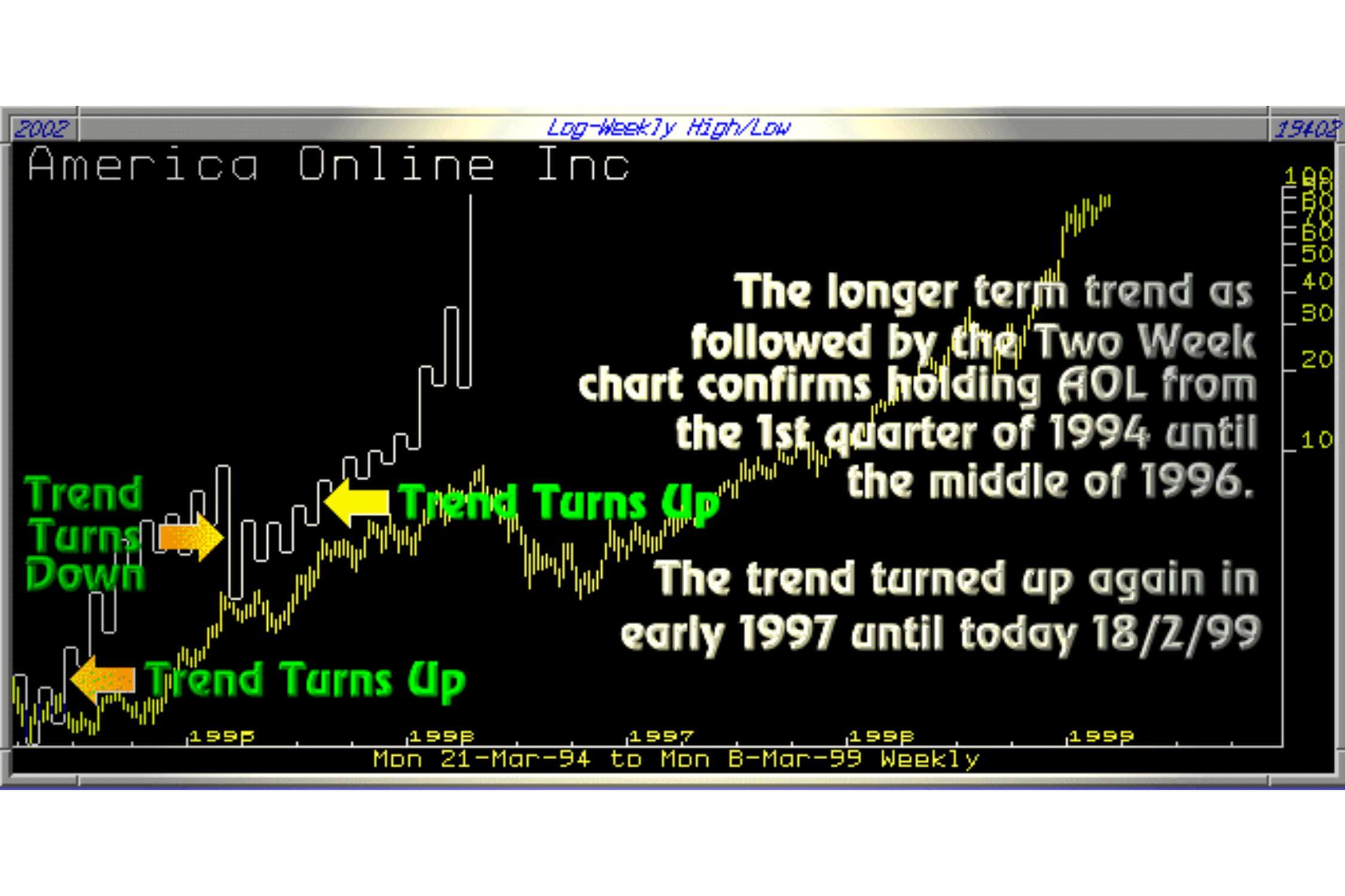
Note 1: Lower tops are not required to trigger rule 2. This takes into account the fact that markets generally fall faster from tops than they rise from bottoms.
Notes 2: The horizontal section of the tops and bottoms of the charts are of equal value and do not take into account time. They are purely there to indicate the top and bottoms of the two-week movements.
Notes 3: As time is not monitored the two-week chart usually lags the day by day chart.
Generating other charts
There are various swing charts that provide different types of signals. All the charts are constructed the same way, the only differences being the time periods involved and the type of chart used.
For example
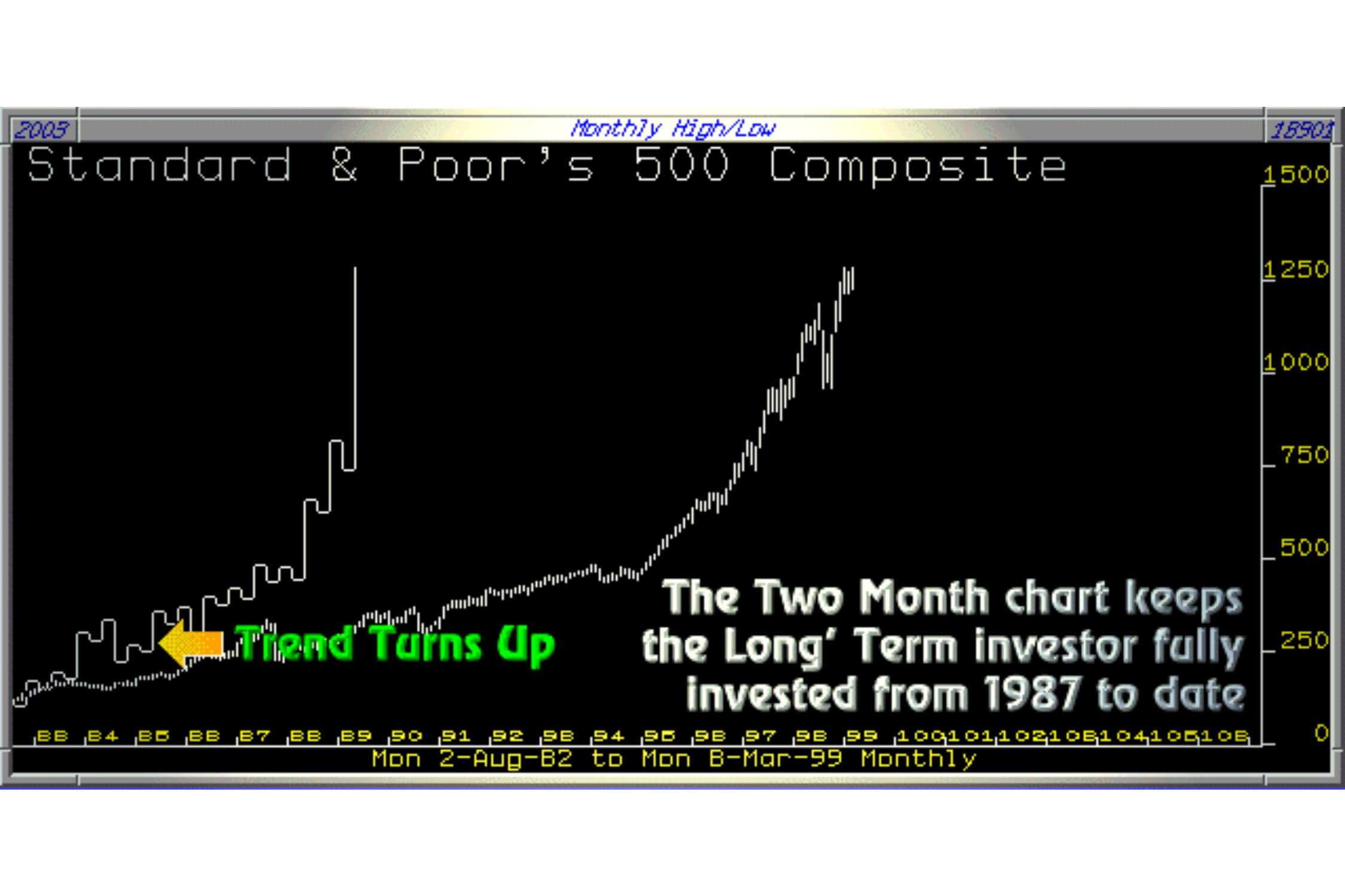
A 'Two Day' requires a two-day period before the trend changes and is constructed on a chart based upon daily highs and lows. A 'Two month' chart requires a two-month period before the trend changes constructed on a long-term chart etc.
Trend Indicator Lines (One day Reversal Charts)
We will be using these Trend Indicator Lines (abbreviated to 'Til' in future lessons) a great deal throughout these courses. They will be used to confirm breaks of support and resistance levels by establishing the first immediate change of trend below or above decision areas.
The short-term trend is established by reference to the trend indicator line (Til).
The construction of the Til is to simply take the line to the top of the 'spread of the day' on any day where a higher top and higher bottom is formed higher than the previous day’s high and low. On any day where a lower top and bottom or just a lower bottom is formed the trend line is taken down to the low of the day.
A 'Within' day - Where the spread for the day is within the spread of the previous day then the line remains where it was on the previous day. That is, if was at the top of the previous day it remains at the top of the 'Within' day. If it was at the bottom of the previous day then it remains at the bottom of the 'Within' day.
An 'Outside’ Day - Where the spread for the day is higher AND lower than the previous day then the line is drawn as follows.
(a) - If the price on the day falls and rises during the day then the line is drawn down to the bottom of the day and then drawn vertically up to the high of the day.
(b) - If the price on the day rises and then falls during the day then the line is drawn to the top of the day and then is drawn vertically down to the bottom of the day. (Our computer charts do not strictly follow rule (b) but compromise by following rule (a) only)
2 - Using the Trend Charts
The Rules are simple.
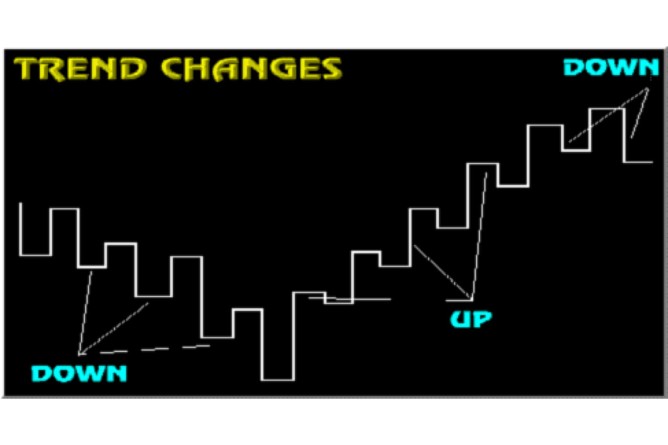
The trend is UP when the last top on the chart is broken on the upside and continues to be positive until the last low on the chart is broken on the downside.
The trend is DOWN when the last bottom on the chart is broken on the downside. The trend continues down until the last top on the chart is broken on the upside.
One of the least explained of all investment techniques is what exactly is meant by a 'break'. We define a 'break' as the Trend Indicator Line confirming the break as shown under. We do not consider the price falling under the level as necessarily a break, A break is only confirmed when the Trend Indicator Line confirms that the 'trend' is established above or below the last high or low.
We have seen some Gann services that are based purely on these charts. Whilst this is a simplistic way of approaching and understanding Gann it is a highly dangerous way of trading or investing. Using this Gann technique alone fails to anticipate future problems and fails to assist in highly volatile markets or tight trading ranges. Dire results are unavoidable in the event of unexpected moves in volatile trading conditions. In such circumstances large losses are inevitably accompanied by the collapse in the trader’s confidence, possibly resulting in severe personal trauma.
It should be understood that these charts are just one piece of a jigsaw puzzle providing only a small part of the whole picture. It is often the most unimportant of Gann's techniques. We find the charts are useful for establishing the trend and a final confirmation of a signal, after all other issues fall into place. They are also effective as exit points (stop losses) in certain circumstances.
Afterthought - If a profitable short-term trade taken out against the trend is followed by a trend reversal on the two-week chart then the short-term trade could be converted into a longer-term investment.
A practical application
Our approach to using Trend charts
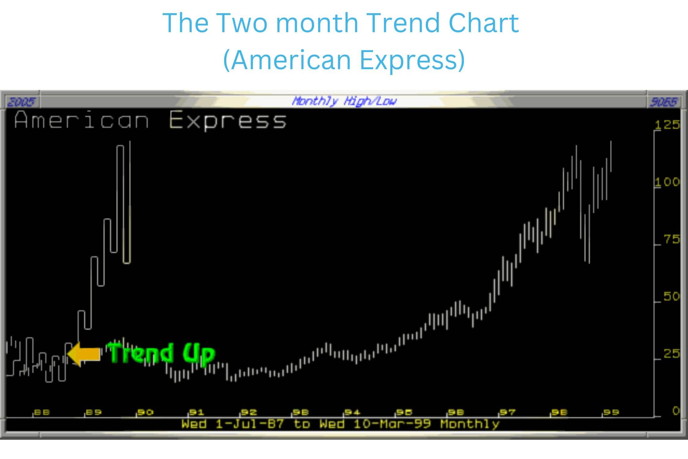
Our recommended approach is to first construct and study the Two Monthly chart. This will establish the long-term trend. The American Express Two Month chart discloses that this share has an established long-term Bull trend dating back to 1993. This has been confirmed throughout the 6 year period by the continual formation of higher tops and bottoms on the chart with no breaks under the previous low on the chart.
The Two Week Trend Chart (American Express)
This chart allows the investor to protect himself from changes in the intermediate trend. For instance the trend turned down in October 1993 until being reversed in April 1994. This would have allowed the medium term trader to direct his attention to a more worthy cause over this 6-month period. Positions could have been re-established in April 1994 with the two-week chart confirming the 'Hold' until August 1998.
It could be argued that a break of the Two Week chart occurred in October 1997 when it fell under 76.5. We previously mentioned that a simple fall under a level was not a break of that level. A lower 'Til' top has to form under the previous low of the Two Week chart.
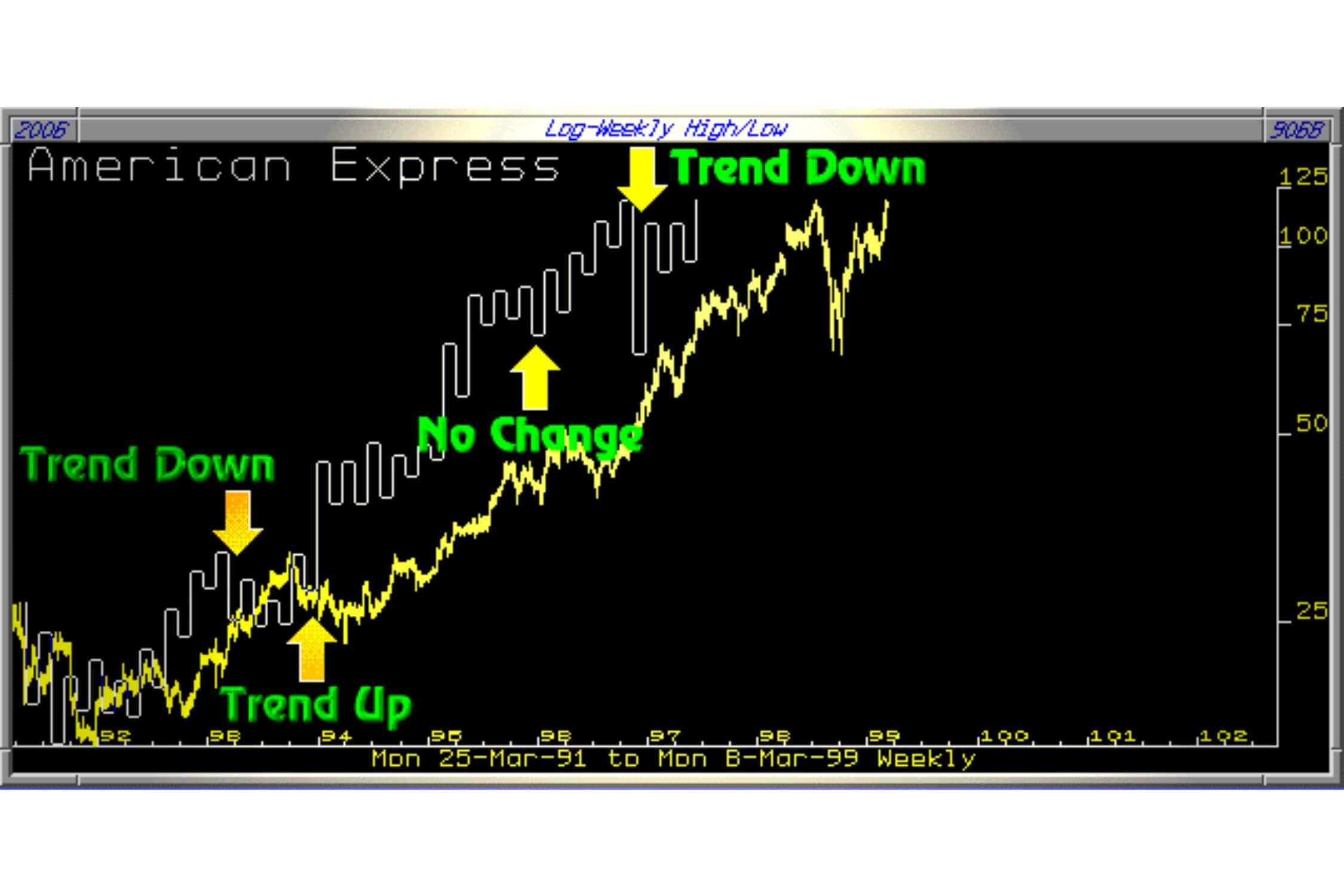
The chart under shows that this was not the case. The drawn dotted line would have had to be formed to change the trend downwards.
At the time of writing (Feb 1999) the Weekly chart is decidedly Bearish with lower tops and low bottoms. This is not a share, as at February 1999, in which to invest. It should, for the time being, be looked upon as a short term trading vehicle, which leads us into the Daily chart.
The Two Day Trend Chart (American Express)
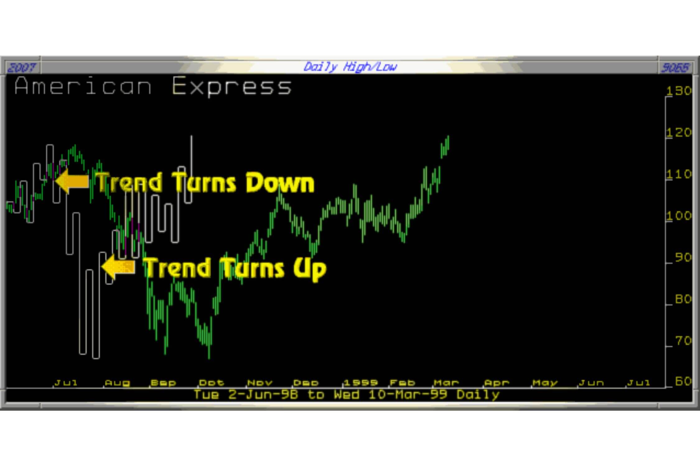
This chart establishes the short-term trend. This chart warns of a change in trend in August 1998 when the low at 104.56 was broken with the downtrend continuing until it was reversed October 1998. The limited use of these Swing Charts, on their own, for trading purposes can clearly be observed on this chart. The 'Short' possibility was useful as the downtrend was signalled early but the upward trend signal was far too late for any practical application.
Assessing The Charts Together (American Express)
A good practical example of an overall assessment of each chart simultaneously would have been in October 1998 when the short-term trend moved up but was countered by the bearish nature of the Two-Week chart thus negating the Bullish Daily chart.
Similarly the Two Week chart downturn in October 1998 would have been negated by the Bullish Two Month chart for the longer-term investor who would still hold the share today. Again it could be argued that the Two Month chart broke to the downside in September and October of 1998 having fallen under the lows of October 1997 suggesting that the longer-term investor should have sold. The chart under shows that the Trend Indicator Line (Til) did not confirm the break.
The One Day Trend Chart (Trend Indicator Line)
A good practical example of an overall assessment of each chart simultaneously would have been in October 1998 when the short-term trend moved up but was countered by the bearish nature of the Two-Week chart thus negating the Bullish Daily chart.
The Trend Indicator Line (Til) is the first indicator for a change in trend and is used to trigger Buy and Sell signals.
Our recent 'Buy' recommendation of Chase Manhattan Bank on this Web Site is a good example of the Til in action.
We had isolated an important decision level at 40. When the share collapsed to the 40 level all we then needed was the final confirmation of the opportunity. This signal would be confirmed by the formation of a higher Til bottom as follows :
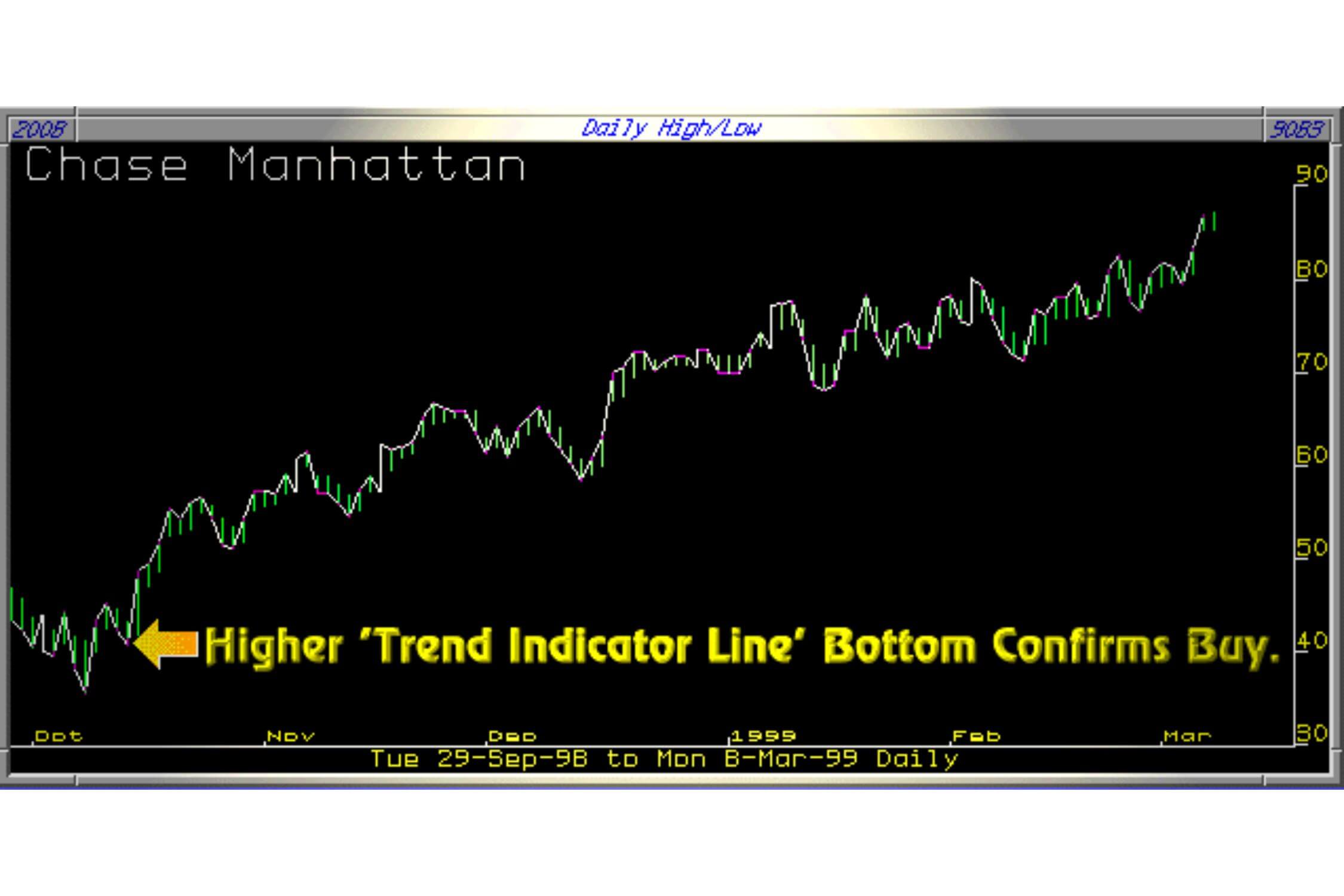
- 1. As can be seen on the chart under, this share bottomed out at 35.56 on the 8th October 1998.
- 2. It then rallied to 45.25 on the 12th October 1998.
- 3. This was followed by a correction down to 40.68 on the 14th October 1998.
- 4. The share then rose on the 15th October 1998 to 48.62 signalling the Buy as the Til had formed a higher Til bottom.
This then is how we use the various Trend Indicators.

